Website for the MillOwner’s Building
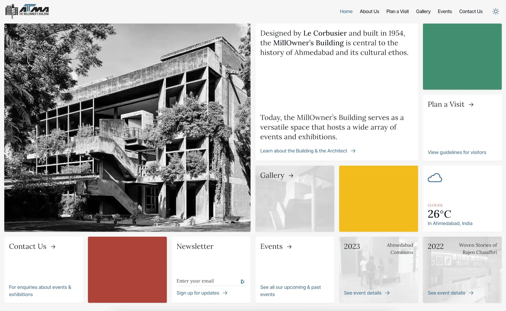
The MillOwner’s Building in Ahmedabad was designed by Le Corbusier and built in 1954. Today, the iconic building serves as a versatile space that hosts a wide array of events and exhibitions.
Design
In designing the website, we drew inspiration from the grid-like structure of the MillOwner’s Building itself. This approach facilitated a responsive design that adapts seamlessly to any device. For the color palette, we incorporated Le Corbusier's iconic colors, which work beautifully in both light and dark modes. Our meticulous attention to detail is evident throughout; for example, the map on the contact page mirrors the website’s color scheme and adjusts to match the selected mode. We take great pride in these thoughtful design touches.

CMS Integration
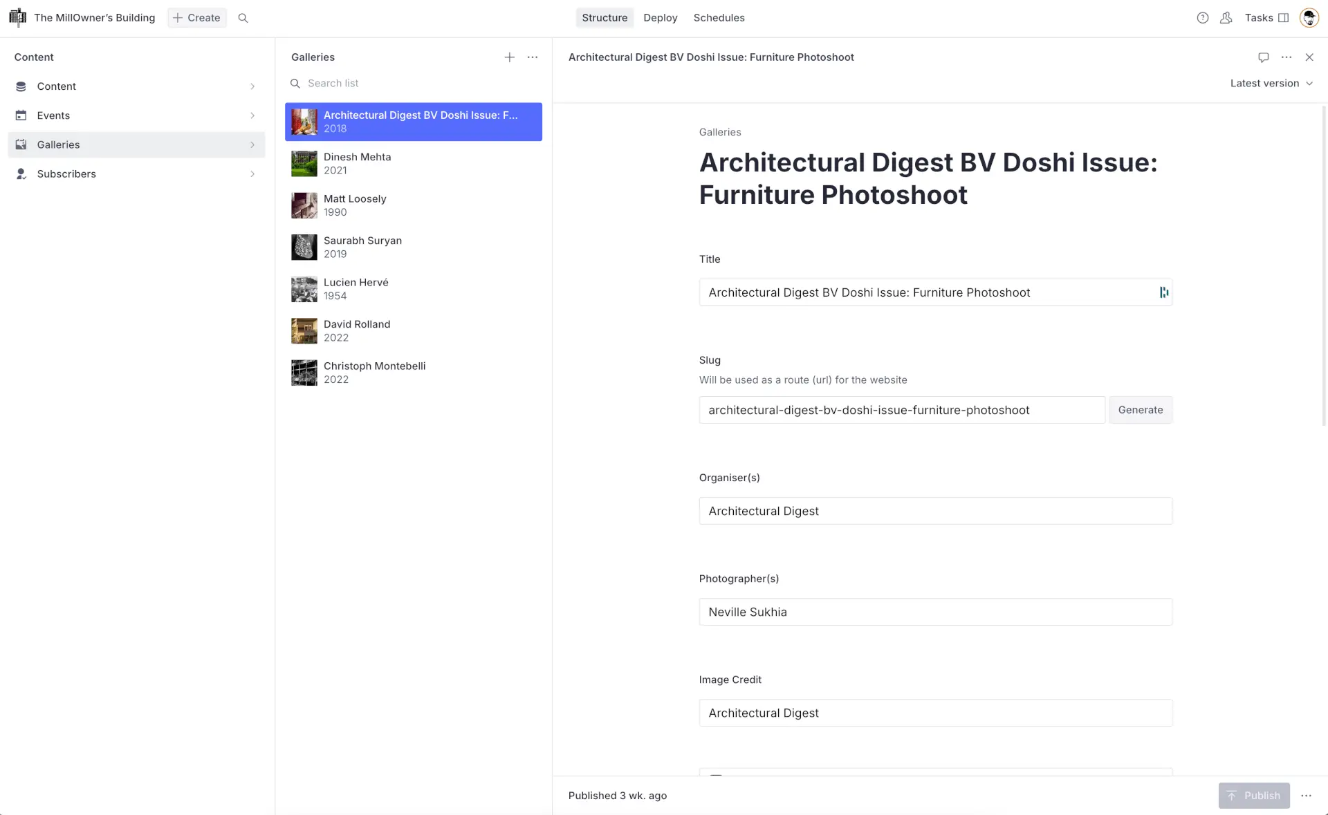
It was important for the CEPT and ATMA management to have the ability to add and update the contents of the website at their end. To facilitate this, we developed an intuitive and tailor-made backend CMS for them. The team is now able to manage the website’s content with great ease in a clean and organized manner.

Results
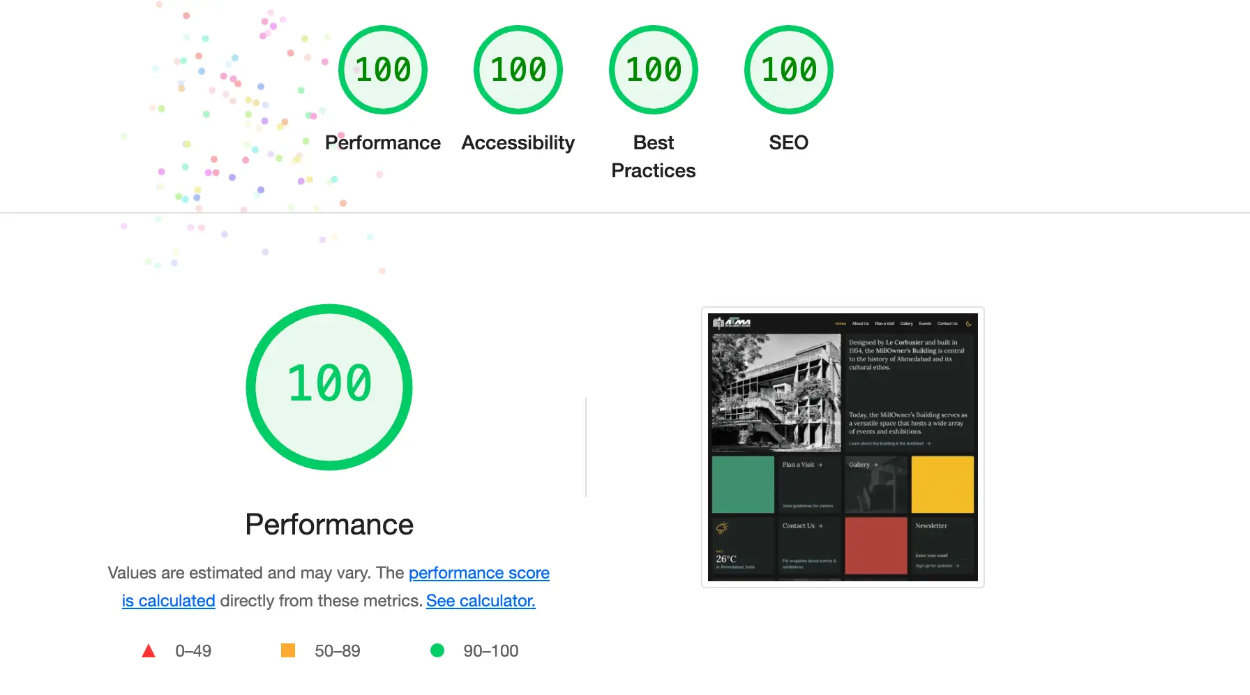
The revamped site not only has a modern design but also achieves perfect scores across all categories in the Google Lighthouse audit. This reflects our commitment to delivering top-tier sites that excel in performance, accessibility, best practices, and SEO.
